Welcome! This is the first article on my new blog, and it examines XE2. I’ll dig right in:
First impressions
XE2 uses the same installer as previous versions, and has a fairly simple setup process. For some reason the help uses a separate installer and so installation isn’t ‘set it and forget it’ – you’ll come back thinking it’s done to find you need to click Next a couple of times and wait for another five minutes.
The first thing I noticed when installing is that the installation components include a cross-platform option! This is a promising start. More on cross-compilation below.
When installed, the IDE starts up much faster than 2010. To be fair, I’ve installed C++Builder XE2 and am comparing it to RAD Studio 2010, so it is probably missing a lot of the packages that the full RAD Studio includes. The IDE looks identical to 2010 (the last version I used.) It still uses plain Windows styles. I’ve been hoping for it to look a little jazzier sometime – Visual Studio is visually very slick, and people, even programmers, do form impressions based on looks. Embarcadero (then Codegear) played with this briefly for 2006 and 2007, when the toolbars in the IDE were rounded Office-style. Unfortunately they moved back to unthemed controls. The new VCL styles provided in XE2 (more on these below) provide a good opportunity for easy slickification of the base IDE, and using them in the IDE would have been a good demonstration of the versatility and robustness of the style engine.
FireMonkey
There is a new set of options in the File > New menu: FireMonkey HD Application and FireMonkey HD Form.
The FireMonkey controls are integrated into the form designer very well. The main difference I noticed is that the form’s borders are a heavy black color, and the drag/resize widgets around a selected control look slightly different.
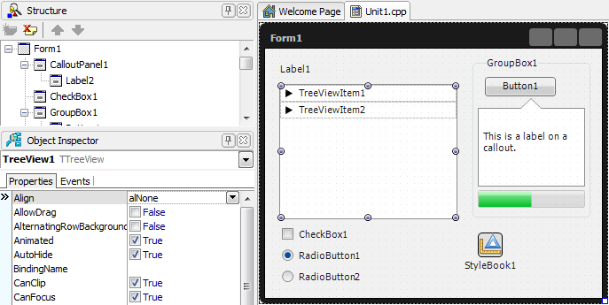 |
| FireMonkey integrated designer |
The control alignment guides (the lines that appear to show when control edges or the text baseline are lined up) are also missing in FireMonkey designer. I rely heavily on these when building a form. They’re essential. I hope to see them reappear in an update, or at least in XE3.
I have found one interesting bug, or unintended result of FireMonkey’s design. FireMonkey controls are built up of smaller components: a button, for example, internally contains a label control to provide the text. In the old VCL designer, you could double-click a component in the Tool Palette and it would drop on the form, or on the selected component if it accepted child controls. For FireMonkey controls, it seems all controls accept child controls, even apparently standalone controls like checkboxes. This has the side effect that if you’re using to adding controls by double-clicking on the Tool Palette, you can end up creating a tree of controls where before, since the VCL TCheckBox (say) doesn’t accept child controls, you’d have a flat set of controls all on the form.
A screenshot probably demonstrates this better:
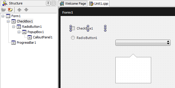 |
| You’re dragging CheckBox1 and only Checkbox1, right? |
The checkbox is the only selected control, but if you click and drag it, all the components visible in this screenshot will move. Unexpected, hey!
You can see the Structure view on the left where I’ve expanded the tree. Unless you’re paying attention here you could end up with an unexpected control hierarchy very easily. This can also be a good thing, though: the building-controls-of-other-controls design of FireMonkey will let you build composite controls very easily. Consider a labeled edit control, for example: in the VCL, to pair a TEdit and a TLabel was complex enough Embarcadero provided an example component showing how to do it (TLabeledEdit.) In FireMonkey projects, this can be accomplished straight from the form designer. With some smarter highlighting, so you can see what you’re interacting with, I think this will be something I’ll really like about the framework.
When controls are built into a tree like this, the Visible and Enabled properties work as you expect. If the above checkbox’s Visible property is set to false, the entire set of controls will be invisible. If its Enabled property is false, all the controls will be disabled. This works better than the equivalent does in the VCL: if you disable a VCL panel holding controls, for example, all the controls will render as though they’re enabled but not react when clicked. A visual/behavior disparity like that is a big UI design no-no, and so often you would end up with code to enable or disable a control and all child controls. With FireMonkey, that will no longer be necessary. A small touch, but a useful one.
Another minor bug: the taskbar icon for a FireMonkey app is this:
I also got this error:
[ILINK32 Error] Fatal: Unable to open file ‘\VMWARE-HOSTSHARED FOLDERSMY DOCUMENTSRAD STUDIOPROJECTSFIREMONKEY 1WIN32DEBUGPROJECT1.OBJ’
I’m running XE2 on a VmWare Fusion virtual machine, and the default projects folder is a shared folder (accessible from both Windows and OSX.) Moving to a non-shared location solves this. I’m fairly sure this is a Fusion glitch, not an XE2 bug.
Property name rationalization, and other tweaks
FireMonkey controls do not necessarily have the same properties as VCL controls. This is the biggest hurdle I’ve found so far using them – sometimes I scroll through the Object Inspector searching for how to set something, feeling lost. I haven’t felt lost in Delphi / C++Builder since I first started using Delphi 1 the decade before last! I spent a good ten minutes earlier today (this is possibly about nine minutes more than it should have taken :)) trying to figure out how to set a progress bar’s position.
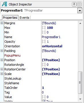 |
| Help! Where’s the Position property? There it is, but that doesn’t look right… |
A TProgressBar does not have a Position property: instead it has a Value property. A TLabel does not have a Caption property, but Text. TRadioButton and TCheckbox do not have a Checked property, but IsChecked.
In general, this seems to be a rationalization of different property names for logically similar things in the VCL. It doesn’t quite make sense that a TLabel has a Caption while a TEdit has Text: it’s the same thing. (Oddly, a form still has a Caption.) Similarly, controls that represent a numerical value (progress bar, track bar, spin edit, etc) all have a value that in the VCL is named Position, Value, etc: for FireMonkey, it’s all Value. I like this. It will take a while to re-learn the framework, but I think Embarcadero have taken the approach that it’s a fresh start, and that’s good.
FireMonkey’s edit boxes, memos and panels do not have the VCL’s default text (“Edit1”, “Panel1”, etc.) This is another small but welcome tweak to the components.
The ‘action’ naming of some properties (Checked vs IsChecked) is a welcome change too. I like this approach to property names, and in my own code often give properties and methods ‘queryable’ or ‘active’ names like this. It leads to more readable code: ‘if Control.IsChecked then…’ is more lucid and reflects its mutable nature when read aloud than ‘if Control.Checked then…’.
The Align property now has about two dozen different alignment possibilities (alCenter, alContents, alFit, alMostRight), etc, although I still didn’t manage to find a way to say ‘bottom right’. With the Anchors property gone, this sort of alignment may be hard to achieve.
Another minor bug: if you have a progress bar with progress and resize it to be smaller, the progress will spill over the side. It reminds me of a Fun Side of Delphi control of Marco Cantu’s… if I remember correctly. (I think, and only vaguely remember, there was an unusual progress bar one year?)
LiveBinding
I should state upfront that I don’t have much experience with data binding. My work does not involve database access or database-enabled controls. My interest in it is to avoid the boilerplate code you have to write when coding data entry or property forms, where controls reflect certain properties, where some controls are hidden or shown based on other chosen settings, etc.
To experiment, I tried to make the value of a progress bar follow a trackbar. It turned out to be quite easy. I selected the progress bar, and its LiveBinding property let me create a new binding. Doing this seems to silently create a new TBindingsList on the form. You can change the direction of the binding, but I left that alone as dirSourceToControl. I then set that binding’s SourceComponent property to my trackbar, and then edited the binding with its editor. This is a bit hard to find: it’s accessible through the dropdown combo box that looks as though it lets you select one of several bindings – instead, it shows a menu. (Embarcadero should use a different glyph than a dropdown combo box arrow here; the control is different to normal Object Inspector dropdowns.) This lets you write expressions for the source and destination control properties. The editor lets you evaluate expressions as strings or its native type, it’s quite neat.
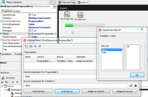
This all worked beautifully at designtime, but unfortunately when compiling I got the following error:
[BCC32 Error] Unit1.h(12): E2209 Unable to open include file ‘Data.Bind.Components.hpp’
And simple though this sounds, I haven’t managed to solve it yet. The file doesn’t seem to exist on my system.
FireMonkey Styles
Unlike VCL styles (below) you don’t set an application’s style in the Project Options dialog. Instead, drop a TStyleBook non-visual component on the form, and set the form’s StyleBook property to point to it. When you double-click the TStyleBook instance on the form, it opens an editor allowing you to load, save and edit styles.
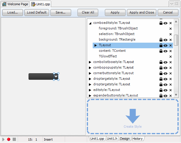 |
| The embedded FireMonkey style editor |
(Embarcadero say that you cannot mix VCL and FireMonkey in the same application, but I suspect it is possible since the style editor appears to be a FireMonkey form. It has several child windows that in the VCL would be windowed controls (buttons, a treeview) that render ever-so-slightly differently to the other controls in the IDE, mostly the text rendering, and the tree doesn’t respond to arrow key keypresses. Spy++ says the whole thing is only one window, of class FMTStyleDesigner. So Embarcadero can do it; we should be able to figure out a way too.)
Predesigned styles are located in C:Program Files (x86)EmbarcaderoRAD Studio9.0RediststylesFmx .
Loading a style (strangely, after changing a style, then to do so again sometimes you need to double-click the style book nonvisual component twice, that is, four clicks) and clicking Apply and Close does not cause the IDE to Make or re-link in the resources. You have to build, or change the form’s code, to get the change of style to take effect. This is a long-standing bug which affects the VCL too – it is quite common to change a property on a VCL form and run and not see the change you made.
There are fourteen predefined styles available, three of which are the ‘native’ Windows, OSX and iOS styles. Some of these are:
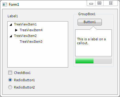 |
| Default (FMX.Platform.Win.style? There is also a separate Windows 7 style file for some reason.) |
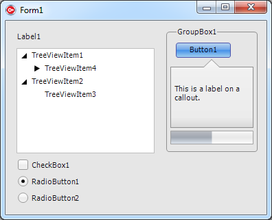 |
| FMX.Platform.Mac.style |
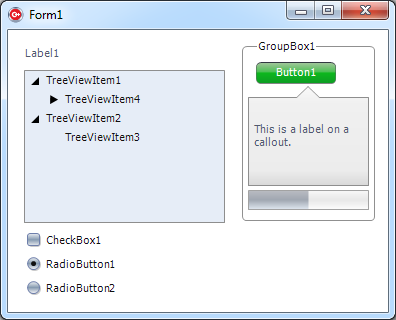 |
| FMX.Platform.iOS.style |
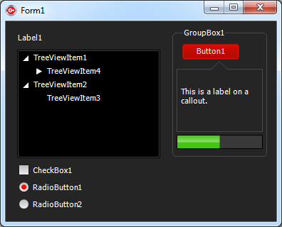 |
| Ruby.Graphite.style |
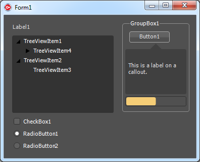 |
| Blend.style |
Whoever designed these obviously likes dark themes; most are a variation on the ‘dark background, light text’ idea. You can see that while the platform themes are similar to the native look-and-feel, they are not identical. I’m not sure what I think about that: I tend to prefer perfection, and perfection here to me would be that Windows themed apps would be indistinguishable from native Windows apps. I would be interested in creating a style that genuinely uses the Windows theme engine – I don’t know yet if FireMonkey styles can be written in code or not.
The text rendering is also very different to native Windows rendering, and it’s lower quality. This and the text alignment inside controls is one aspect that definitely needs improvement in the next release.
Several times while changing the style the IDE got confused if it was debugging or not. If you have the program running and change the style, then the Run / Terminate buttons switch to enable Run again. Clicking it does nothing, clicking Terminate then terminates, and you have to click Terminate one last time before you can run. I also managed to get the IDE very confused about its projects: it had an Open dialog open for a style, but I also closed the project and opened another. Keystrokes in the editor then vanished, presumably going to another window.
 |
| The IDE, two Open dialogs and the running app. I have no idea how I did this. |
There is clearly room for some final bugfixing and polish for the FireMonkey designer / IDE integration.
VCL Styles
Most of this post has focused on FireMonkey. The VCL has some tweaks too, the most noticeable of which is style support. VCL applications can now be ‘themed’ without the need for third-party libraries. This setting appears to be application-wide and is set in the Project Options > Application item. This now has a subitem named Appearance, but which settings are in Application and which are in ApplicationAppearance appears to be arbitrary. (Runtime themes and the icon, for example, are not on the Appearance tab. However, the IDE now has builtin support for adding a custom manifest, something that will be useful for those wanting to add elevation or another manifest attribute to your programs. I wish they had included a few pre-set common manifests other than just runtime themes.)
The inbuilt VCL styles are ‘Windows’ – the default which is basically ‘no theme’ – and a number of basic custom themes. The dialog has a neat Preview button that allows you to get an idea of what the theme looks like before you apply it to your application. Frankly, though, they’re ugly.
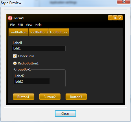 |
| Previewing one of the inbuilt styles |
I think they’ve been included more to demonstrate that they can be than as useful themes Embarcadero expects people to use. I suspect and hope we’ll see some high-quality VCL themes appearing in the community over the next few weeks.
The Tools menu has a new item in XE2: VCL Style Designer, and this tool allows you to create and edit style files, stored as .vsf (VCL Style File?) Interestingly this also lets you redefine the built-in system colours.
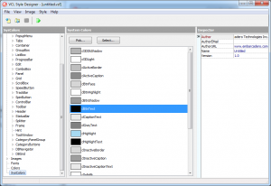 |
| The VCL Style Designer, showing the ability to edit colour constants |
This means that controls filling their background with, say, clWindow will change their background colour when the style is applied. This is a good feature: many style engines look half-built because when one of their themes is applied, only half the controls draw using their colours. It will be useful for other things too – for example, software that runs on board ship often needs a day and night mode, where the colours change to night-friendly when dusk falls on the bridge. Applying this sort of colour change across an entire application with a mix of VCL controls, third-party controls and your own custom components can be a real mess, and being able to redefine the system colours should help solve this – so long as the code uses the clSomething constants not GetSysColor().
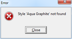
VCL styles do seem to be a bit buggy. My test VCL app had a button, label, edit and memo, and I decided to add a page control to see what tabs looked like. When I ran it, this dialog appeared:
Continuing runs the application with no styles at all, not even Windows themes. In other words, it renders like a Windows 98 or 2000 application.
I haven’t managed to get a page control to work at all yet. Oddly, a TTabControl works fine.
There appears to be no way to translate VCL styles to a FireMonkey style, or the other way around. The underlying engines are probably completely different, so this is understandable, but anyone wanting to create a style will have to decide up-front which UI system they want to make it for.
OSX Applications
This is the big one. This is the reason I bought XE2. (Through work, I have a perfectly good copy of 2010 – cross-platform is the only reason I have bought my own copy.) I’ve been looking forward to Delphi and C++ Builder on OSX for half a decade. You have no idea how much I’ve been looking forward to it.
But I can’t build an OSX application.
I bought the Starter edition. I’m twenty-something and traveling the world (I’ve typed this article in two airports so far, and I’m on my way to a third right now) and the $2600 roughly for a new Pro license plus the yearly upgrade is way out of my budget. Before XE2 was released, I read that the Starter edition would allow OSX compiling, and I bought it yesterday afternoon on my way to the airport without reading the data sheet. It turns out it doesn’t.
I don’t understand where Embarcadero is aiming with the Starter edition: it’s missing seemingly useful-for-anyone features like the Local Variables view, yet it has Watches (a more advanced feature, surely?) It doesn’t have source code, when it’s useful to any programmer, especially a learner, and they run no risk including it since it’s copyrighted to them anyway. And now I find you can’t compile OSX applications with the Starter edition. I truly don’t understand this: I want XE2 only for OSX apps. I couldn’t care less about coding a Windows app; I have a Mac and I want to use Delphi/C++ Builder on it. I thought compiling was the most basic of all features, something sure to be included with any IDE, even with the most basic of Starter features. It’s not.
I’m not quite sure what to do here: get a refund? Buy Pro? (It costs as much as a round-the-world airfare – I could put that money to good use :)) Ignore XE2 altogether?
Perhaps Starter is a hook to get you to buy Pro. Certainly I find it annoying enough to either ditch completely, or upgrade. My loyalty to Delphi will probably make me upgrade, just with a bad taste in my mouth. It shouldn’t be like that.
Overall
Overall? It’s great. There is a massive amount of new material in this release. I’m astounded they managed to do all this in a year (perhaps they really took two years, which is why XE was such a minimal release.) There are some bugs and there’s room for plenty of features and tweaks, but overall it’s more stable and featureful (way, way more featureful) than I expected. It hasn’t crashed yet. Those of you using 2009 and earlier, or even 2010, will appreciate why I point that out. Even the bugs that are present have a ‘minor’ feeling to them. The product feels robust and Full Of Stuff. That’s excellent.
I am disappointed with the decision to not allow Starter to compile for OSX. I think compiling is a basic, fundamental feature for an IDE, and since cross-platform is the ‘big thing’ for XE2 not being able to compile for one platform is a mistake. It takes the ‘2’ out of XE2, basically, and treats those of us who use Macs as second-class IDE citizens.
I can’t let that sway my opinion too much, although my opinion is, honestly and fairly, that this was a mistake and I am a bit annoyed. But everything else is great – and I do mean great. Exploring it has left me with that fun feeling of discovery that I haven’t had since I first used Delphi 1-3! Score 9/10.
(This is my first blog entry, and is a massive three thousand words – six pages in Word in draft form. I hope to be slightly shorter next time! If you like this blog, subscribe. It will mix Delphi and C++, but everything should be applicable to programmers using either language. Articles I’m considering writing over the next few weeks are a XE2 World Tour report (I’ll be attending in Cologne in a few days) and a series of articles on using vanilla GDI and achieving transparent / alpha-blended rendering and effects without using GDI+ or another library. Let me know in the comments if this sounds interesting.)


Leave a Reply