Since
XE2 Update 4 was released, there have been a few online complaints (
1,
2) about FireMonkey’s fonts on Windows. I had most of a blog post written explaining why it actually was fine, when I read that there will be a
hot fix targeting this and other issues. I guess it is an issue after all, then!But when it comes to FireMonkey’s text, there are more important things than antialiasing or fitting to the pixel grid.
From the perspective of text UI controls & fonts, this article will examine:
- FireMonkey as a cross-platform UI framework
- How FireMonkey actually looks on different OSes
- What you can do to improve the native look and feel of FireMonkey
- Some ideas for FireMonkey enhancements (because you shouldn’t have to do anything.)
FireMonkey is a cross-platform UI framework
FireMonkey allows you to design your forms once, and run your application using the same windows on both Windows and OSX. The immediate problem is that these platforms do not look the same, and it goes beyond styles. (
Styles are not skins: they are how FireMonkey controls render. It’s almost a side-effect that you can have a variety of different styles to skin the application.)
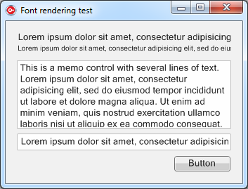
Consider this simple app which I originally wrote to demonstrate font rendering. There are three versions, built with the VCL, with FireMonkey, and with Cocoa. It has a couple of labels of two different sizes (a heading-like size and a normal one), an edit box, a memo and a button.
 |
| VCL on Windows 7 |
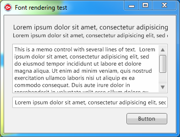 |
| FireMonkey on Windows 7 |
The differences are not vast on Windows. Two things are immediately obvious: the text is lighter due to its antialiasing, and the controls are not quite identical: the scrollbar doesn’t look the same and the button has a slightly different shadow. These things, and similar issues with other controls, can be fixed by improving the Windows style.
Here is the same app in FireMonkey and Cocoa incarnations on OSX:
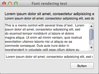 |
| FireMonkey on OSX Lion |
 |
| Cocoa on OSX Lion |
The differences on OSX are larger, and this illustrates a specific example of a more general issue. On OSX, FireMonkey controls do not look or behave very like native controls.
Some obvious differences just in the screenshots are:
- The fonts are different. FireMonkey is not using system-like fonts, and the text is visibly different to native apps. This is most visible in the memo control, where the FireMonkey text is tiny compared to the default Cocoa font, and on the button, again where the text size is smaller.
- The presence of scrollbars. Lion does not show scrollbars; they only appear when you begin scrolling.
- More minor things: labels don’t truncate with ellipses (I don’t think FireMonkey can do this yet, I couldn’t find a property for it) and the Cocoa ‘memo’ is focused by default when the window opens.
- One issue not in the screenshot is that the memo changes it background colour to grey when it is focused.
These are too large to focus on today, but in the spirit of discussing fonts, and to pick the low-hanging fruit as far as consistency goes, let’s focus on what can be done to make this app look more native on OSX.
Manually making the app look more native: fonts only
This Cocoa app uses three fonts:
- System 13 for the memo, edit, and button
- Label 10 for the small label
- Title 13 for the larger label
The FireMonkey one, by default, uses:
- Segoe UI 11 for all controls, unless changed
at least when it is created on Windows 7. I have no idea what it uses on XP. OSX, of course, doesn’t use Segoe UI.
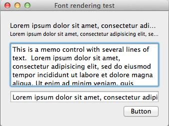
At first glance this is simple to fix: let’s change the controls’ Font properties to match the Cocoa app. You get this:
 |
| FireMonkey on OSX with tweaked fonts |
First off, woohoo! It looks a lot more native already. Second, the memo looks… broken. In spite of entering the lorem ipsum text as one paragraph, the lines seem to be automatically split where they are wrapped on Windows, and now when using a different font the line breaks are in the wrong place. (This is terrible. The only line breaks present in the text should be where they were deliberately entered.) Still, it’s a good step forward.
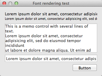
But what happens when you run this OS X-specific version on Windows?
 |
| FireMonkey on Windows with OSX fonts |
Now, that doesn’t look bad at all… but it doesn’t look like a standard Windows app any more now either. (Note that the memo, even if it has inserted line breaks, has at least got them in the right spot.)
What can you do, right now?
So, if you’re a developer using FireMonkey right now, and don’t want to wait for any changes or tweaks that might arrive in the future (such as those I’m about to suggest…), what do you do?
If you are writing only for Windows: FireMonkey looks and behaves pretty close to a native app. You don’t have much to worry about.
If you are writing only for OSX: I suggest you change your fonts manually to match the default system ones. These are easy to find by dropping a control on a window in XCode, and looking at its properties.
If you are writing for both Windows and OSX: it is more complicated. Remember, FireMonkey is meant to be a cross-platform UI framework, and you’re supposed to be able to use your forms ‘as is’ on both OSes. Some possible solutions are:
- Design two different forms, one for each OS. For a cross-platform framework this shouldn’t be necessary; you might as well write your front-end in Cocoa.
- At runtime, depending on the OS, iterate through the controls on your form and adjust the fonts.
- Do nothing. You can at least compile for both OSes; getting a perfect look isn’t necessary.
Moving forward
In spite of FireMonkey’s imperfections there are heaps of great things about it (it’s always easier to spot problems than the absence of problems), and I’d like to see it become commonly used, robust, and as close to native as possible. Here are some suggestions for improving it.
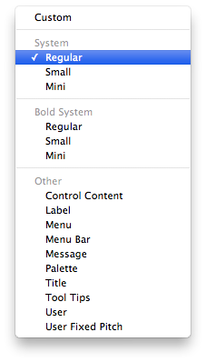
First, fonts (and control sizes etc) are important. Apple does something very interesting in XCode: while you can select a specific font if you want, by default you are given a number of preset options:
FireMonkey should do something similar. In a cross-platform framework, there is little point in the default way of changing a font’s properties being as detailed as ‘Segoe UI, 11, italic and underlined.’ Instead, while these should be accessible just as they are in XCode, a TFont object should have a number of basic types available. Only if you manually change the font properties would it revert to ‘Custom’. These types represent basic UI functionality, and map to different fonts on different OSes.
A mockup:
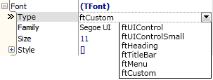 |
This is what FireMonkey’s TFont should have.
(The items shown are examples, not gospel.) |
This would also be useful for the VCL. In my professional outside-of-blogging life, the software I work on suffers from the default font being Tahoma 8: fine for XP, but not right for Window Vista or 7. At least it’s consistent throughout the app, but I wish I could just say ‘This is a normal control, render how it should look on whatever version of Windows you run on, please.’
The principle here is to use a standard by default, and change custom details when necessary. Here it’s for fonts; I tend to think the same applies in many areas, far beyond the scope of UI controls.
Wrapping up
The ideas here can be generalised and extrapolated to much more than fonts. I may look at other UI consistency issues in another article.
Being able to compile a Delphi app to OSX is pretty amazing – as anyone who spent most of the 2000s hoping for it to happen knows :) This sort of thing really is polish and detailing. Polish and detailing matter – I wouldn’t hire anyone who thought they didn’t – but in the grand scheme of a developer’s life, it doesn’t matter
that much. It tells you a lot about FireMonkey that the biggest internet arguments about it in the past few weeks have been about, of all things, text antialiasing, even though there are bigger
design issues. Nevertheless, it would be nice to have cross-platform apps feeling native on whichever OS you deploy them, and I hope some design changes are made that make this easier by default.
Don’t forget: this should be your take-away image:
Leave a Reply